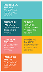
Primary Color Palette
The Stanford Medicine Children's Health color palette helps reinforce the organization's connection to Stanford, while also clearly differentiating us as caring for children and expectant mothers. The main color is white and should be utilized to reflect open, clean and fresh space. The primary palette includes white and warm greys to create a clean, open, hopeful and modern feel. It also includes cardinal red, reinforcing the connection with Stanford. This is balanced with a pop of bright red that feels young and approachable.


Connect with us:
Download our App: